Frank Lloyd Wright vs. Andrea Palladio
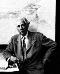
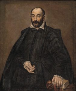
by John Henry (October 2020)
This is a tale of two architects at their best. Is it fair to compare their chief iconic residential designs separated by over 400 years? Would you expect the newer modernism to trump the old classical order?
The historic appeal and genius of Andrea Palladio’s work has been replicated thousands of times over that of Wright’s. There is a reason for this. The classical tradition was usurped in the 1930’s with the advent of the International Style. The nearly three-thousand-year architectural tradition that epitomized the zenith of western culture was interrupted suddenly by war and the need to rebuild quickly. It was never assumed that this Tradition would be completely abrogated by a totally new approach based on mass production techniques, but that it would be picked up after the immediate needs were met. But the facts of the last 70 years show that it has become the standard approach for commercial offices and public buildings and housing — the strategy/ethic also applied to private homebuilding.
I have come to believe that the Modern vs. Traditional way of building has political roots and there is no doubt that one position clearly stands for a single procedure/approach that cannot include the other, while the reverse was never posited. We are seeing this today in our present political discourse. The Modernists have built up an architecture of intolerance which upholds a zeitgeist suiting their own view of the world and our culture. Wright, an avowed socialist, also had a similar egotistical view: his approach and method was superior to any other and he promoted himself as the best architect in the world at the time.
Indeed, like President Trump’s intention of returning to early Republic architecture for public buildings, Palladio had a similar intention: “By favoring a Roman style, Palladio rejected the Gothic architecture that had had a noticeable presence in the Veneto region where he worked. By doing so, he sought to contribute to Italy’s systematic purge of ostensibly foreign and barbarous influences—an effort that extended beyond the arts and into the realm of politics.” — John J. Burns

It is interesting to note that Wright’s early work and while at Adler and Sullivan’s office, was an elaboration on Americanized European period historic styles with much embellished detail. This is what was most popular. Later, he abandoned any reference to classicism and the dreaded ‘cornice’ and vilified those who practiced in any classical style. His views, of course, were incontrovertible.
Having completed a 5-year regimen at Texas A&M University with the Modernist philosophy pushed through my veins, and after experiencing our current political polemics, I have revisited some evocative memories of two amazing designs that sit squarely on opposite stances.
++++++++++++++++++++++++++++++++
There are two houses that a discerning, inquisitive, and inspired architect must visit in person — at least once in their lifetime. In fact, anyone with an artistic bent and of historical inquisitiveness should be impressed by either of these structures. Both Palladio’s and Wright’s archetypal designs represent a distinct point of view based on the time, vision, and available materials and technology.
These two architectural legends vie for ‘best architect’ status over the years. For the United States, Wright has generally been voted best by the architectural profession. The favorite design mentioned most is Falling Water in Bear Run, Pennsylvania. Palladio is recognized worldwide as one of the most brilliant mid Renaissance architects. His most famous residential structure is Villa Almerico Capra, built outside Vicenza, Italy. A series of residential designs previous to this villa mirrors the same theme. Wright completely broke with his own philosophy to create Falling Water.
In one metalist covering all built structures worldwide, Wright’s design ranks ahead of the Acropolis but behind Hagia Sofia (which comes in at number one!)
While the Pantheon and Jefferson’s Monticello, both directly associated with Villa Capra are on this list, both are ahead of Palladio’s design, which ranks near the bottom.
Over many years, both houses were copied and modified per private needs (and to claim some bit of originality), becoming the basis for much residential work in Europe and the United States, especially during the Neo Classical period and from the 1930’s on. The Palladian motifs are better known by the general public than those of Wright’s and the classical style has been repeated for several generations now. Wright’s houses are so idiosyncratic that only a few homeowners and builders find them economical to replicate and even desirable to purchase and maintain.
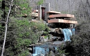
I took my pilgrimage tour of both houses approximately 5 years apart. But I recall the salient features from both clearly, now about 15 years later. Let me start with a quick list of similarities and differences:
The overt similarities —
- Both are somewhat isolated from the larger communities nearby
- Both were built for a well budgeted individual
- Both are finished with a form of stucco
- Both have three levels
- Both had no central air conditioning and rely on wood fireplaces for heat; FW had radiant floor heating and possibly through decorative copper tubing.
- Both were intended for seasonal living, as rural getaways to commune with nature and leave the noise, pollution, and hubbub of the city behind
- Both tried to mimic or outdo their contemporaries
- Both designs aspired to greatness
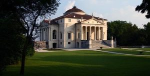
The overt differences –
- FW and VC were built hundreds of years apart in two completely different cultures, styles or approaches to architecture
- FW has an immense structural system reinforced with steel in concrete. VC has no foundation. “It is self-sustaining thanks to the arches and the brick cross-vaults on the ground floor, which constitutes the structural grid of the perpendicular axes on which the upper floors rest on.” – ArchEyes
- FW has flat roofs; VC is pitched with a dome at its apex
- FW has electricity; VC had none
- FW has no basement, but stairs down to the brook; VC has a ‘basement’ on the ground floor from which hidden spiral stairs allow staff to serve the principal occupants
- FW is linear and horizontal; VC is vertically oriented
- FW is built into an environment; VC commands the environment
- FW is under 3,000 SF in size; VC is probably 3 times the size
- FW is a free form individualist expression; VC is based on precedent and is part of the classical idiom
- FW has no interior wall paintings; VC has extensive frescoes
- FW was overseen by Wright and his office to the end; Palladio died before VC was completed
- FW is somewhat humble but daring; VC is monumental and almost religious in effect
- FW is completely asymmetrical; VC is totally symmetrical
- Palladio listened to his client; Wright offered up a completely different program
These two structures cannot possibly be viewed as similar in any way other than by a few basic and obvious facts. They each evoke a completely different response. In one, you are in and part of the forest, in the other you are looking out at the forest and views. You are constantly looking upwards from the moment you set foot at Palladio’s majestic design. You are humbled. At Wright’s you take the long view out and around. You feel welcomed, warmed. It really is an amazing set of variables that imprint and bind the ethics and world view on these two houses by each architect.
The Wright house is essentially non-conforming to any notion of ‘house’ or of architecture at the time; Palladio’s design heralds the history of architecture originating from the Greeks and Romans and builds a monument memorializing his forefathers. Palladio builds on the past; Wright is inventing the future – but was he?
The new International Style had challenged the Prairie House collection that had made Wright quite famous at the turn of the century. He felt he was behind now in the mid ‘30s; he hated the press the new modernists were garnering and his prime motivation in this project was to outdo them, not to follow his client’s directives. Kauffman, the department store magnate and owner of Falling Water, wanted just a simple cabin across the running water to view the small falls. Wright instead built the daring design on top of the falls. It was not ‘of’ the falls. (Wright pontificated that no house should be on a hill but be ‘of the hill’.)
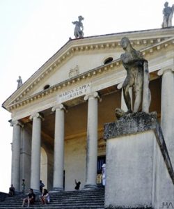
Villa Capra, also known as ‘La Rotonda’, was intended to be built on a gentle sloping hill, overlooking the lands below in all directions. The Greeks believed that man was superior to nature, the gods being over all things. No Greek temple was ever built in a thicket or forest glen. If there was vegetation nearby it was cleared back. The temples to the gods had to be perfect. They were symmetrical, like man. They were built high on hilltops if possible. The Romans followed suit. Contemporary private houses in the last 100 years have landscaping planted near the outer walls and framing the structure. Succeeding private and courtly traditional houses of the 17th through 19th century followed the advice of Renaissance building guides and kept vegetation clear of their foundations. Palladio and other early masters claimed that any planting close to the foundations would be injurious to the structure – and they were correct.
La Rotonda is clearly inspired by the temple form that early Renaissance builders and artists had unearthed and venerated. Palladio joined in meticulously measuring and drawing the temples in the Forum and others scattered across Rome and the Italian countryside. He published these drawings and added his own designs and suggestions on the best quality of soil, location on a plot of land, and proper materials with which to build, etc. His predecessor Vitruvius published likewise and was considered the first architect of the western world. Palladio assumed the title of architect during this period. Before this time there were no ‘architects’, only contractor/stone masons because nearly every edifice of the time was constructed entirely of brick and stone. The Pantheon in Rome, with its own dome and temple front, was Palladio’s inspiration. Masons and sculptors, like Michelangelo, were considered inferior social positions as opposed to canvas and wall fresco painters. Their hands were always dirty, unlike writers, orators, philosophers, and merchant princes of the time. Architects did not have a professional organization for hundreds of years.
Palladio foreshadowed one of Wright’s famous spatial tricks in fact. He creates a monumental façade and through a clearly indicated main entry door, always centered, one is squeezed through a relatively long and narrow entry hallway to open in a magnificent 3 story circular space crowned by a dome. Wright employed the same effect but in his own peculiar manner. One must first identify or locate the front door, often hidden or not clear. Then you are stuffed into a tight low-ceilinged foyer which subsequently opens into a glorious 8 to 9-foot high living area, in some cases vaulted. While Falling Water is about 8 feet to scarcely 9 feet high floor to ceiling in the principle living area (with secondary rooms under 7 feet) the largest rectangular room in La Rotonda is over 20 feet high and the central circular formal living space is 55 feet. The overall height of La Rotonda is more than 90 feet above grade while Falling Water is about 23 feet at its tallest from first to second floor, not counting the stairs to the falls below.
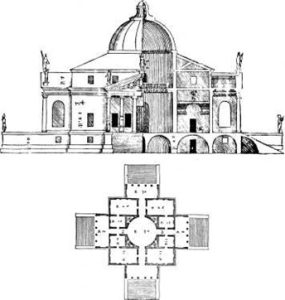
Palladio’s design contains principle rooms on the piano nobile that are based on a proportional system devised from ascertaining the ideal dimensions he measured from the monuments of the ‘ancients’. The width and length of the rooms had to have a certain height to feel ‘correct’. In fact, this entire structure is a study in geometric pattern, underscored by proportional numerology and reference to musical intervals. Palladio, like his peers, believed in a mystical or divine order of proportion. Wright, unlike Corbusier who developed his own system of proportions based on the human form – like Leonardo’s universal man – held no such belief. His approach was a simple appreciation and intense study of natural elements, forces, and their interconnections.
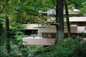 One thing that Wright observed was how thin branches could extend horizontally with only a slight bend. He also saw slabs of stone projecting out of a larger mass without support. He then likened the cantilevers of Falling Water and others of his projects to the thin wide platter held in the middle by the palm and fingers of a waiter. Cantilevers were not widely used in the International Style at the time. Nearly everything was post and beam with the floors in line. This was the effect Wright used and amplified here, as on the contemporaneously built Johnson Wax building. There, he defied the Wisconsin industrial commission and test loaded the tapered mushroom topped columns to 24 tons, a factor of weight to height much higher than the engineering of the day allowed.
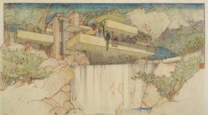
There is one single rendering or photograph that sums up Falling Water: a low shot across the brook, looking up at the house. (see below, Wright’s emblematic rendering)
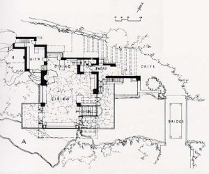
When you visit, you must follow a trail to get to this spot and this is not the first thing you see, although highly anticipated.
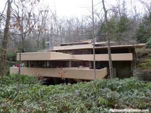 The first impression is a very horizontal massing of thick concrete terrace walls and thin roof slabs (see above), hovering as if by magic, offset by vertical stone elements on one side. As you enter from the narrow end (right side) into the living room and then proceed to the decks overlooking the water and view into the forest, you have essentially absorbed the meaning of the house. It is doubtful that Kaufmann clearly understood the totality of his investment at the outset when schematic plans and orthographic views were shown to him. There is clearly a disconnect between the now iconic rendering and how one actually first experiences the design.
Palladio invites an easy and retrospective walk around the entire structure, where the animation of statues contrasts with the geometric order of a nearly exact four-sided façade topped by a dome. When you set foot on the property, you feel like you are entering a religious shrine, something like that of the Taj Mahal, but very private and introspective. It is quiet, you can hear the wind in the trees, and you almost feel like you have arrived at a place of meditation. The structure towers above you and the grand staircases are not exactly inviting. Instead you start walking around the building scarcely believing your eyes as you see the same façade over and over. You go back and forth examining several perspectives and note how windows and doors are in line, the box of the house broken and embellished with moldings, the smooth surface of the stucco, the interplay of statues, columns and shadows cast.
Moving around inside Falling Water borders on the claustrophobic. Wright’s measure it is said, was his own slight build. The spaces seem too sandwiched but otherwise flow together connected via large banks of glass to the outside. FW was not to be a large rural mansion but a getaway. La Rotonda is a study of grace and offers much more to ‘see’. Moving inside Falling Water is straightforward and a linear experience. In contrast, the impact of La Rotonda’s central round room is astounding. There is no doubt that Kaufmann had business associates to impress when visiting in Bear Run. Wright was sure to sense that and realized that this one house was to be his greatest. Likewise, Palladio’s client was building a shrine for himself and to impress his guests.
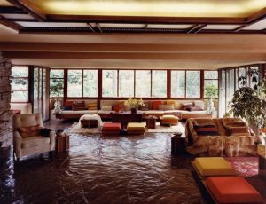
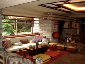
You look left and right in the busy open space interior of Falling Water. Glancing at the various groups of seating you have no clear idea where one function or activity stops and the other starts. The kitchen with open counters is visible in the back and opens into the combined living and dining room edged with banks of windows and built in furniture. It is glary inside and the colors, a bit ‘dated’, tend to clash.
 Material changes are everywhere as well. Rock, stucco, wood, painted metal, and the waxed stone floor with a piece of the native rock projecting through must be digested all at once. The movable furniture is multicolored to offset the low light. For after dark and in the gloom of winter, Wright includes something of a large artificially lit skylight in the center of the living area as a concession, which illuminates the space. Other skylights around the perimeter bring in the natural light. Even with the artificial light on and sunlight bouncing through the thinly framed metal glass doors and windows, the low expanse of this ‘open plan’ living area tends towards dim and a somewhat uncomfortable contrast. There is one bank of windows in the dining area opposite the large glazing facing the predominantly southeastern facing cantilevered terraces that allows cool reflected light. In the summer, this lower level light may be appreciated, but would be desperately wanting in the winter. Wright eschewed drapes, so at night there would be large expanses of darkness.
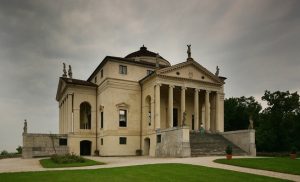 La Rotonda was started in 1550 and intended not only to serve as a suburban retreat but to make a political statement. The original owner had connections to the Vatican court and possibly the ‘religious’ imagery evoked — the temple porticos, dome and interior painting narrative — was something that Palladio and his client agreed was important, although nearly all of Palladio’s work in the Veneto features the temple front with four to six columns and pediment. As in the Venetian palaces, the first or ground floor is utilitarian. The principle living areas are typically raised off grade and accessed by a series of steps. Most of these grand stairs have no side railings but here Palladio creates a safer system that involves cradling the wide stairway with thick buttresses which remain level from beginning to end of the run, so when one reaches the top there is no longer anything guarding you from the 12 to 14 foot drop at the covered porches.
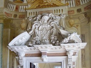
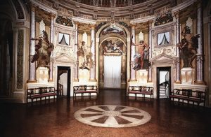
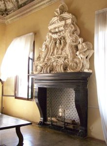
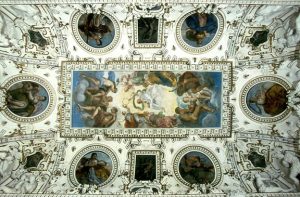
The great shock when visiting La Rotonda is the incredible contrast between its somber exterior and the vibrant baroque fireplace surrounds, florid stucco work in the ceilings, and vivid frescos. There is trompe l’oiel in the great hall paintings and the eye is seduced by the colorful spectacle from the floor up to the inside of the dome. Light filters from the glass in the oculus and bounces in slightly from the adjacent rooms and halls. Theoretically, if the oculus were operable, the entire structure would self-ventilate very efficiently – as originally intended. The oculus in the Pantheon is open as is Scamozzi’s own version of La Rotonda, built later, west of Padua. The interiors for this design approximates Palladio’s original sparse concept for La Rotonda. The interior was embellished after Palladio died and under an artistic program unknown to him while under construction.
Both La Rotonda and Falling Water arguably have a connection to nature. Wright’s masterpiece is said to be emblematic of his ‘organic’ style of architecture. It is easy to see this particular design, after his vaunted Prairie period, as some kind of foreign object that was placed in the forest — an intervention. Now, Falling Water is one with nature as growth around it has almost engulfed it.
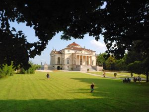 On the other hand, La Rotonda borders on the ethereal and is free from nature’s grasp. It gently commands the hill on which it is placed and has a monumental effect. It is surrounded by lush green landscape and large clear lawns. There is a mystical quality that resembles the history of another of his designs called La Malcontenta. Any temple portico motif of the Renaissance evokes multiple responses. Classicism based on the Greeks and Romans has a powerful sway on the psyche. You are not only contemplating the imitation of a temple, your mind goes back in time and searches for everything associated with the culture that produced it.
Palladio writes this of La Rotonda: “The site is one of the most pleasing and delightful places that one could find because it is on top of a small hill which is easy to ascend to; on one side it is bathed by the Bacchiglione, a navigable river, and on the other it is surrounded by other pleasant hills which resemble a vast theater and are completely cultivated and abound with wonderful fruit and excellent vines; so, because it enjoys the most beautiful vistas on every side, some of which are restricted, other more extensive, and yet others which end at the horizon…”.
Palladio, a Mannerist architect, built over 20 villas in the Veneto mostly for citizens of Venice. One traveler noted: “The villas are inserted into the landscape, and they produce a harmony between the solid volume and the natural space which surrounds them.” – Helena Ariza.
The way belvedere, or summer homes, were used at the time is instructive. The houses were rarely occupied in the winter and used exclusively as summer getaways from the heat and bustle of the city. Owners would pack all necessary furniture, cutlery, clothing, and bedding – even tapestries, on barges and float them up the Brenta River and its tributaries to their summer places. Servants, friends, and pets were included.
 The day rooms were situated for views and cool shade in the summers. Windows and doors were left wide open to catch the breezes. Villa Rotonda had perfect cross ventilation. The thick walls kept out most of the heat. Outdoor eating and sleeping could be enjoyed on the covered porches. Fresh fruit and vegetables were harvested on property or obtained nearby. Fresh milk and meat were also available. Life was truly splendid. Servants lived on the ground floor and served, cultivated, and guarded the residence. Wine, meats and produce would be stored on there as well.
The problem of security necessitated loading and transporting anything that was movable as the buildings were never completely safe from burglary. (Frescos could never be ‘stolen’ off the walls.)
Wright’s earlier work used pitched roofs and wood framing, which kept the houses protected against the weather, heat and cold. Falling Water has an entirely concrete perimeter wall and roof and showcases floor to ceiling windows and doors throughout. It has nearly zero energy efficiency due to no real insulation. Energy costs were negligible at the time and furnaces made up the difference in the winter. This house has absolutely no ‘green’ aspect to it. Heat and cold radiate around every perimeter wall and window and directly through the uninsulated concrete roof. For Wright it was always art first, practicality last.
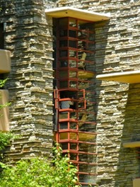
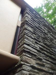
Wright was able to get away with professional murder because of his dominating personality and the fact that, though unreliable, his houses were quite simply beautiful. They offered something else, too: freedom and a heightened sense of space and light. Wright introduced the western world to the concept of open-plan living; the plans of his houses flowed. His buildings connected to the outside world, blurring the distinctions between interior and exterior, landscape and architecture. Fallingwater went one step further: it made a dynamic and convincing connection between an uncompromisingly Modern architecture and a wild landscape. The house appears both to have landed from outer space on its rocky waterfall site and to be growing out of it. – Jonathan Glancey
No working drawings for construction exist for Villa Rotonda, but Wright has a record set of blueprints. The orthographic views of construction documents, in general, are quite clear when trying to decipher the intent of the architect for traditional buildings but seem obscure in the case of Falling Water. Only perspective drawings and photography from angles can showcase the dramatic cantilevers and seemingly exploding composition of Wright’s intention.

Some interesting facts about Falling Water:
- Kaufmann’s only child studied under Wright as an apprentice before the house was commissioned.
- Kaufmann finally decided on interviewing Wright after reading his book An Autobiography. The client paid Wright $8,000, aged 67 at the time, to design FW and initially hated the concept. Wright had procrastinated to the very end and barely assembled the drawings to convince Kaufmann at the first review. After moving in, and enduring the high humidity during summer and winter, Kaufmann nicknamed the place “Rising Mildew”.
- The cost of $75,000 to build exceeded the original estimate by $40,000. This corresponds to a total cost in 2019 of $2.8 million to build a house of 2800 SF of living area, or approximately at $1,000/SF.
- There is nearly as much space devoted to decks as interior space
- Only two colors were used — an ochre for the concrete and stucco and Cherokee red for the steel frames of the doors and windows.
- The cantilevers were reinforced surreptitiously with more rebar by the contractor and engineer yet after restoration to counter the sagging decks and other items in 2001, the total cost came to $16.6 million (2019 rate) to remedy the problem. The initial deflection was measured at 7 inches over a 15-foot span.
- Wright once mused that the concrete be covered in gold leaf.
- Ayn Rand interviewed Wright to compose The Fountainhead.
- The house sits on 1,500 acres, entrusted by Kaufmann Jr. to the Western Pennsylvania Conservancy.

Here are some points of interest concerning La Rotonda:
- The house did not receive its interior decoration until 1591, as ordered by the Capra family. Palladio did not envision any serious decorative program as carried out by the painters Maganza and Canera. He was sufficiently pleased with the abstract and perfectly conforming geometries he envisioned in the base construction.
- The dome of Palladio’s original design was much higher than that built by his successor Scamozzi. Palladio intended an open oculus, as in the Pantheon, but Scamozzi built a cupola with glass.
- The four corners of the house are rotated 45 degrees from compass quadrants in order that each of the perimeter rooms take in sunlight at various seasons.
- The third floor, or attic, was a storage area for grain, kept dry and also offering an insulating value from heat and cold to the main rooms below.
- While the entire envelope looks to be made of some kind of solid cement or stone, it is constructed of interior and exterior brick courses with rubble inserted in the center – exactly like the great structures of ancient Rome. Even the columns are made of brick. The exterior finish is a stucco lime which repels insects, defeats mold, has integral pigmentation, is hydrophobic, is more flexible than Portland cement without cracking, and is self-healing.
- Palladio died in 1580, before Villa Rotonda was finished (as did the original owner Paolo Almerico), at the age of 72. This was his last and most important residential masterpiece. He never secured a commission for any Venetian palace as he proposed in palatial designs for the city much illustrated in the Quattro Libri. He did build one church.
- Ironically, Scamozzi wrote a treatise titled L’idea dell’architettura universal (“The Idea of a Universal Architecture”). This predates the notion of the “International Style” by over 300 years! An essay by Javier Berzal concludes: “La Rotonda has a perennial quality to it; Palladio’s use of classical elements emphasizes a universal architectural language.”
Not only Wright but many other modern architects have problems with water penetration through flat roofs. In addition, the cantilever, including the steel supported porch in the Robie House, over time experiences ‘creep’ or the tendency of steel to deform and elongate. This causes cracks in the concrete and sagging. Water freezing and expanding in the cracks further exacerbates the problem. La Rotonda no doubt had issues with the intersection of the circular rotunda over the flat square roof below, but never experienced the same level of damage and cost of repair.
Of Wright’s and Mies van der Rohe’s lack of concern for the long term durability of their designs, Chicago architect Gunny Harboe notes: “They didn’t really understand how things would perform over long periods of time, nor did they probably care about it.” “They were more interested with making something that was in their mind, what they wanted to make, and doing it in a beautiful way. And how that would get dealt with in the future was sort of left up to others.”
One last point of interest. Palladio and Wright both ‘corrected’ flaws in earlier drawings for publication at later dates. They studied their previous work and always found ways to improve and enhance. Several of Palladio’s villas were never built as intended. Both architects designed projects that were never built. Wright has over 800 plans on paper of which only 380 were built and many are still standing.
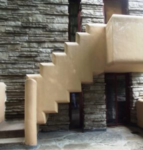

Finally, my experience with the Wright design was clinical and hypercritical. I noted the clever inventive details, discovering here and there how the features that we studied years ago made this such an outstanding work – with no small measure of guarded jealousy — smiling in finally seeing the sum that represented my university hero and icon whom I revered above all others.
There were the exaggerated perforated overhangs (to cut weight, yes, but then the sun is not blocked?), the idiosyncratic Wright touches everywhere. Going through the house, on the terraces, and from room to room seemed to be a very short tour. I did not take the path to the ‘ideal spot’ and made almost a cursory examination, amazed at the small spaces yet outward reach, feeling in the end somewhat disappointed but pleased that the final half of my quest was completed.
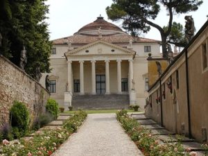
On the other hand, walking up the ramp through the entry gate of La Rotonda, arriving at the highest ground, and seeing this ethereal construct finally before was a heady out of body experience. After circumnavigating the block and staring at the geometric perfection, scrutinizing the moldings, peeking into the ground floor rooms, gazing at the farmland below and away, there was a hesitation to even attempt the flight of steps to the portico and proceed inside. It took me some time to do muster a courage I did not expect to exercise. I remember a solemn quiet.
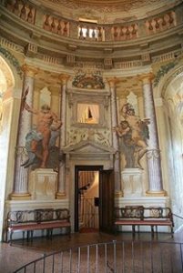 The scale of the place, while smaller than any ancient temple, is delicate yet not uncomfortable even though ‘larger than life’. One feels dwarfed in a tranquil way. The paintings on walls and ceilings, the baroque plaster flourishes and stone carvings, animate the perimeter rooms so that you completely forget what you had just experienced outside. You are able to ‘breathe’ metaphysically. The mind is invigorated, thoughts flow quickly. Imagination is quickened.
The natural light that pours into three large windows of each of the four principal camera is sufficient (there was candlelight or oil lamps when originally occupied for the night) and finally the central domed three to four story circular hall erupted into view with an orgy of colors – gods and creatures, mythical and religious — on the walls. In the center of the circular stone floor is a similarly perforated gorgon (designed to capture the rain that never fell in this case) through an oculus and down to a cistern as in the Pantheon. I turned on my heels round and round marveling at this theatrical tour de force.
In my mind, there was no comparison, yet I am ambivalently drawn to both points of view, of architectures separated by nearly 400 years due to a technical and practical education on one hand and a romantic and humanist notion of art on the other. I vehemently object to the edict from the left that classical architecture is forbidden to be the source of inspiration, of innovation even, or reproduction, ‘in our time’. Our time is thousands of years older than the relatively short Modern period.
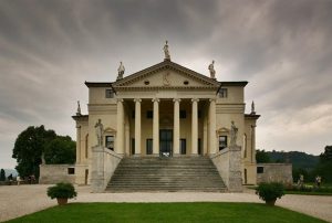
BEAUTY will result from the form and correspondence of the whole, with respect to the several parts, of the parts with regard to each other, and of these again to the whole; that the structure may appear an entire and compleat body, wherein each member agrees with the other, and all necessary to compose what you intend to form.
– Andrea Palladio