by John Henry (August 2023)

A Bigger Interior With Blue Terrace and Garden, David Hockney, 2017
Well, I actually did like the house initially, a Mid Century Modern (MCM), that was for sale in Winter Park, Florida close to where I live (in my ‘66 model no style ranch). No smooching though. The style, emerging in postwar suburbs, helped satiate a market starved for low-cost housing for returning GIs, and available to a market with extra cash in their pockets for everything: muscle cars, new TVs, vacuum cleaners, and any new gadget.
MCM is the architecture of ideas, created by those who believed the forward-looking style could be a vehicle for social change to create a better society. Mid Century Moderns, when designed by the Euro import Modern masters are stunning, especially in larger designs on view lots mirroring the landscape in the extensive glazing. Opposed to darker traditional house interiors, the light penetration through immense walls of glass and even smaller panes between walls and ceilings is astonishing.
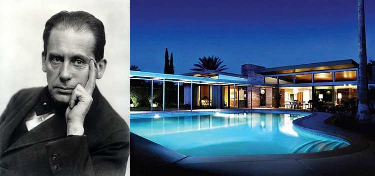
I have several associates who idolize this architectural period, but I was wont to even visit one specimen for many years. I thought I understood the idea well and had gone on the Chicago FLW tours years earlier to see similar designs. But I have abandoned and rejected the underlying ‘start from zero’ approach developed by the ECMs (Early Century Moderns—1925 – 1950) as taught by my professor and Dean, who was apparently emotionally, philosophically, and religiously affected by the likes of Gropius, Saarinen, and Corbusier. “Form Follows Function” and so unnecessary things are stripped down, the result abstract and planar, and any decorative fuss verboten. Students at the universities absorbed everything without question. The MCMs have been with us from about 1945 to the 1980s.
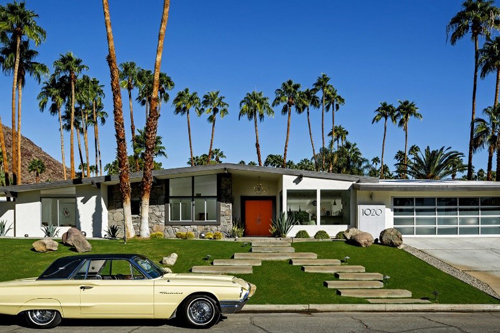
The general public has been on some kind of retro craze for these houses for over 20 years now.
And so I finally had a chance to see a relatively nice suburban model built in 1959 by a local architect who had some standing a few years back. I finally got it.
It was about the light, open space and quirky but clean details that have been absent from many cookie-cutter spec houses offered up by architects and merchant builders for decades.
The housing market has reverted to a different style or approach after probably 50 years of traditional/regional home design. These entry level and move up models have gotten cuter on the outside with regional and historic period details, but with contemporary interiors, and with higher ceilings offering a bit more light in narrower lot conditions. Consumers are also on a retro-Modern kick with black window trim and facia, large square windows and a sort of austere look. “Transitionals,” they are termed.
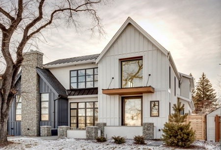
In general, there is a slight darkness with period interiors for years now, even though the typical approach up and down the eastern seaboard has been to include compartmentalized formal living and dining rooms up front with open Family/Kitchen/Breakfast spaces in the rear – and in Florida, “pool planned” with large sliding glass doors on the back. Houses are evaluated by the square foot and when you cram in the formal rooms, the rest of the spaces must be smaller – as prices increase.
This formula changes in areas where formal spaces are eschewed and since the whole idea came from California architects, what you see in MCMs are no formal living or dining areas and a totally open informal group of rooms. Even studies are in open halls – space efficient. So it seems more ‘open’ and since there are no formal rooms at the entry, the foyer opens directly into inviting airy spaces with light now coming from the front of the house, the side and back. For the same ‘square footage’ MCMs seem like they are larger and a better deal.
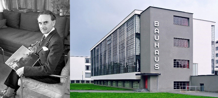
So who were these California architects? They were not of ‘native’ American stock of the time. No, this was part of the same group who abandoned Germany, France, and Italy either during or right after the last world war (who felt discriminated—the artists and architects) and were recruited to help us develop rocketry to get to the moon, atom bombs, and bequeath us… Modern Architecture. The ECMs were of Bauhaus roots. The work of industrialization and mass production of building materials in Germany (and other parts of Europe) in particular, was ahead of the United States. These imported high priests took over our universities, totally abandoned all vestiges of the teaching of classical and period style architecture and ushered in through clever manifestos, zany sketches, mesmerization, coercion, and political argument—the International Style. These were buildings that could be built identically in any social or climate zone of the planet. No one cared about energy costs in the late 40s and 50s so we had high rises, low rises, brutalist (from ‘Brut’ French: concrete) town halls, and all sorts of creative work in the name of progress, economics, and the social good. The principal motif was combine the latest in building and machine technology to its fullest and throw off any vestiges of pomp and circumstance. “The House is a Machine For Living.” Well, it made sense to many—especially high-rise developers who were happy to get rid of gargoyle carvers, metal craftsmen, and decorative artists—except for the massive murals that were used in order to cover up huge blank walls.
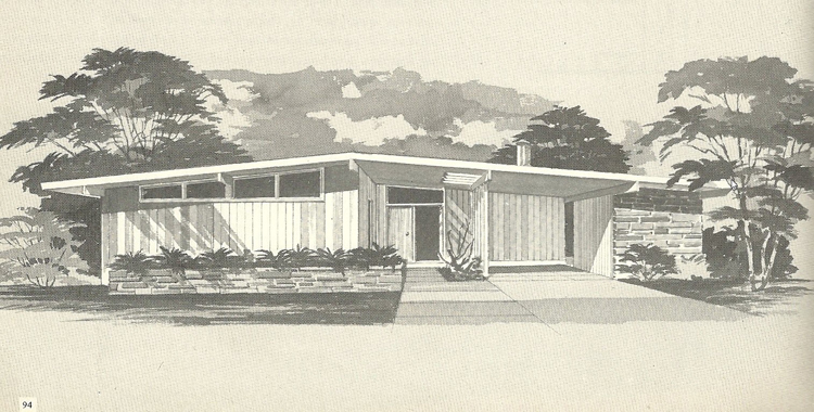
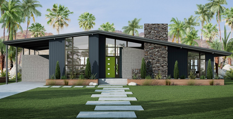
The MCMs apparently were designed to appeal to those who purchased houses, not industrial facilities or pretentious architecture. So the architects and builders introduced more open plans, cut down a bit of the glass, did away with the formal rooms, abandoned any traditional architectural theory and historical approach as usual, and topped them off with slightly pitched roofs. You have to look closely but the definitive roofs were barely a 2:12 pitch compared to 6:12 for the typical traditional designs (a concession that stymied the ECMs which could only have perfectly flat roofs in order to make obvious that they had nothing to do with the aggravation of rain and snow and any pretense of tradition) and much steeper pitches for Tudor and French styles. They were also made of tar with a gravel topping. In the intermediate years, the retrofits included the commercial built up roof which is finished with a rubber sheet.
But there were other architects who introduced butterfly roofs and steeper geometries which made the interiors much more open and ‘breathable’. Also, the ends of the rooms had huge swaths of glass set in aluminum frames.

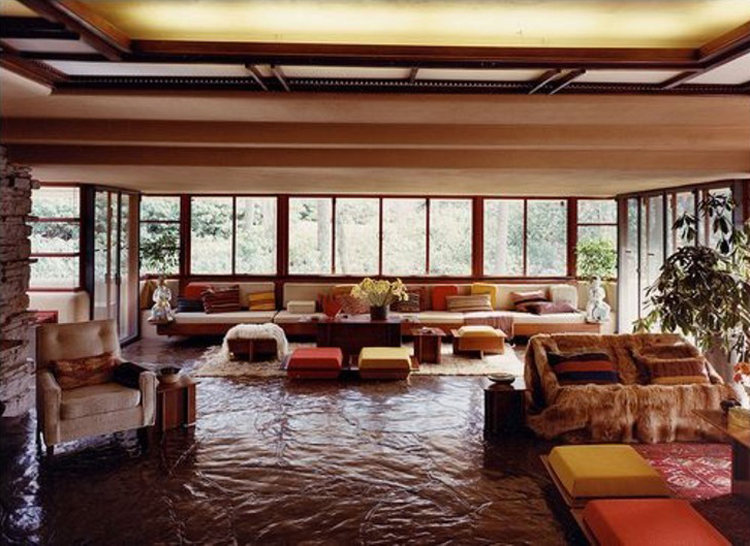 Architects such as Richard Neutra in California and like-minded Modernists around the country were happy to create light filled stylish new post and beam designs for style-hungry occupants later the same size gypsum board (sheetrock), including 8-foot wood studs, meant that floor to ceiling heights were typically 8 feet – especially by the mass development builders. To dare to go to 9 feet was considered a milestone and act of bravery by the architect. One of the odd sensations of these ECMs which spilled over into the MCMs initially were large open flat spaces with low ceilings and nearly floor to ceiling sliding glass doors and fixed glass on the perimeters. This was also picked up by Wright for Falling Water, which imparts a sort of squished down feeling in the totally open living areas. Palladio would be incensed as these are not close to any proportions of height to width to length he proposed for his villas and human occupancy.
 Fortunately the MCM architects addressed this issue by introducing slightly vaulted interior spaces. These vaults (otherwise termed ‘cathedral ceilings’) were built under an already low pitched roof that spanned the longest axis of the house and nearly every room under the main vault was pitched. The roofs were very thin looking and consequently offered zero insulative value at under 8 to 10 inch thicknesses. When you include swaths of single pane windows open to any compass direction (especially in subdivision merchant-built housing) the result was enormous direct and radiant heat that could barely be overcome with standard air conditioning of the time. In Palm Springs, where many houses had no AC at the time, the houses were occupied seasonally. Otherwise, you were roasted or fried.
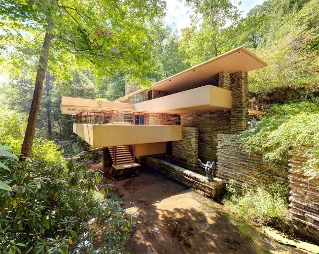
Wright’s Fallingwater had a concrete roof and the expansive glazing added to a nearly uninhabitable structure except when the weather was amenable. Kaufmann, the owner, derisively termed it ‘Rising Humidity’, especially as it was built right over a creek. But he also fell for the MCM magic and had another house built in Palm Springs, but not by Wright (to his chagrin) but by Neutra.
The smaller derivative designs are easy to spot in subdivisions of the 40s through late 60s. They tend to be oddly placed on small lots and have none of the elongated proportions of those designed by the early proponents on larger properties. So they tend to look unsightly next to their more traditional ranch style brethren and out of place, full of deferred maintenance and not worth remodeling.
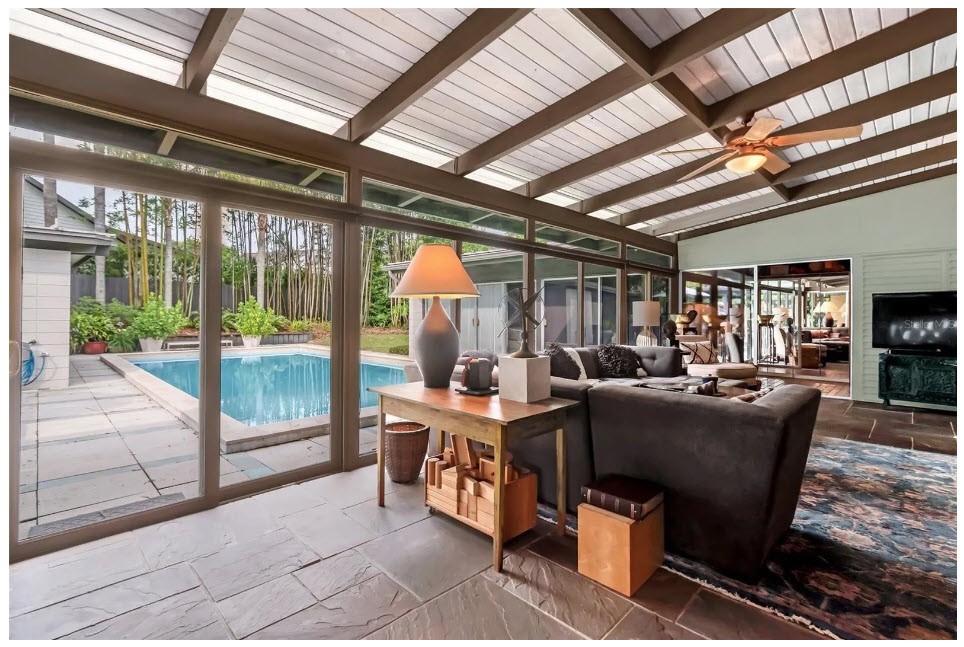
The demure appearing house I visited recently had a small 7-foot ceiling foyer and then opened up into 9 to 11-ish foot vaulted beamed ceilings. This is a trick Wright used routinely. Today’s spec and custom homes have 9 to 10 foot first floors and 8 to 9 foot second floor ceiling heights, often double height living, dining, and family rooms. The MCMs were noted for initial affordability (the merchant-built ones), functionality, post and beam structures, slightly larger living rooms, and light filled space. But they were relatively small footprints. Even at that time they did not take the market by storm. California had a regional Spanish hacienda heritage that continued, as well as Colonial, Tudor, and other period house designs being built throughout the rest of the country.
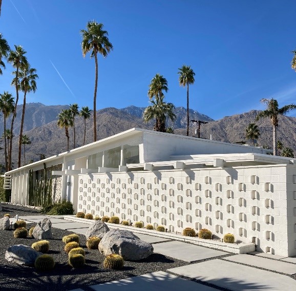
The working man’s MCM had a Jetson palette of colors: mustard yellow, ochre, orange, brown, and beige – or it was stark white. If you looked closer you would find decorative concrete block and exposed rafters built on wood beams that divided the interior from the exterior – a case of extreme weather stress on a single material. There were high window strips over perimeter walls, plywood with upgraded veneers, and a lot of painted or stained wood siding inside and out. There were linoleum, wood, stone and even terrazzo floors, formica or higher-grade wood cabinets and countertops. The kitchens were small by today’s standards, as well as bathrooms. Closet space was minimal. The custom homes had a lot of stainless-steel counters and cabinets with flag stone and slate or brick floors.
If you come upon an ‘original’ be prepared to buy it knowing that you have a Ferrari of a house that requires constant upkeep and maintenance. The single pane glass will not meet current codes and will need to be replaced and roof insulation added, in order to feel comfortable and reduce energy costs. Extending roofs over expanded double or triple sliding glass doors would assist minimizing solar gain and from drying out and fading furniture and any wood inside. Electrical wiring should be replaced and all the plumbing as well. Formica tops to granite would be nice.
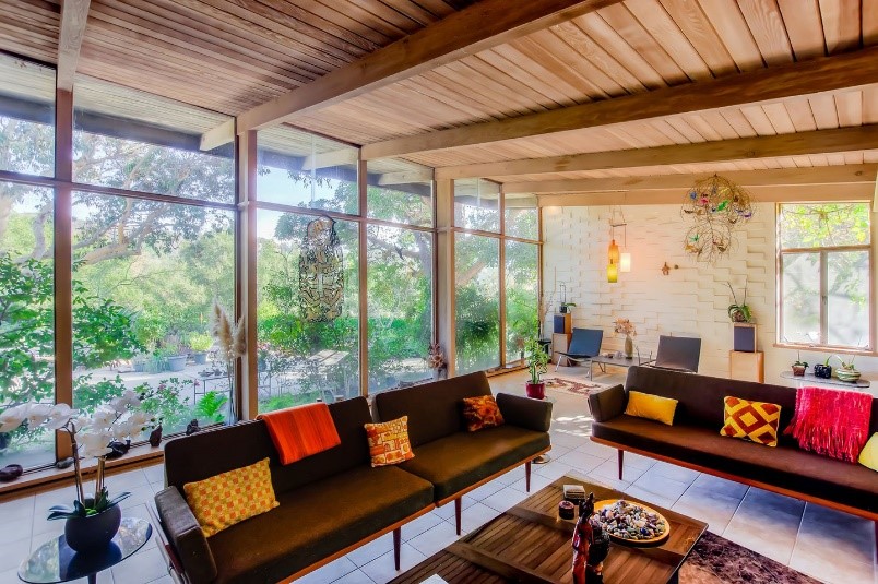
Another key aspect of these MCMs and ECMs is that there are no traditional moldings of any kind or decorative details. Traditional moldings and window and door casings cover construction irregularities between the intersection of walls and floor and ceilings, and other attached components. Which means that to replicate exactly an MCM or its earlier progeny, the level of craftsmanship must be very high and therefore quite an extra expense. Most have stretched exterior facades, are low hung, and rarely two story. Horizontality is part of the mantra, probably having to do with Wright’s ‘hug the earth’ philosophy.
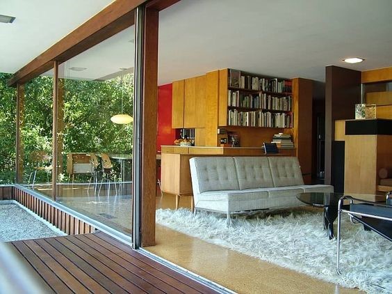
Sunken tub/shower combinations were popular, but soaking in angular marble tubs wasn’t comforting and water temperature was sucked out by the cold stone. Cabinets were often elevated above the floor to allow for cleaning underneath. Aha—Cleanliness and easy upkeep had to have something to do with the style! Upper strip windows over walls and cabinets were also designed to let in as much light as possible. Some of the windows were obscure glass. You will see jalousie windows as well. Stainless steel counter tops in kitchens were typical in high end homes.
As if not enough light was introduced in most of the rooms, skylights were added. Selection of size and coloration of small tile in all bath areas tends to be repeated.
The allure of these newly discovered houses is their quixotic difference in the quality of interiors, simple and clean (yet dated). Due to expansive glass, you are at one with nature outside. That can be good or bad depending on your location relative to longitude and time of year, and proximity to other houses and landscaping. The smaller models tended to group all bedrooms together in order to share baths; current planning involves separating the Master Suite from secondary bedrooms for privacy reasons.
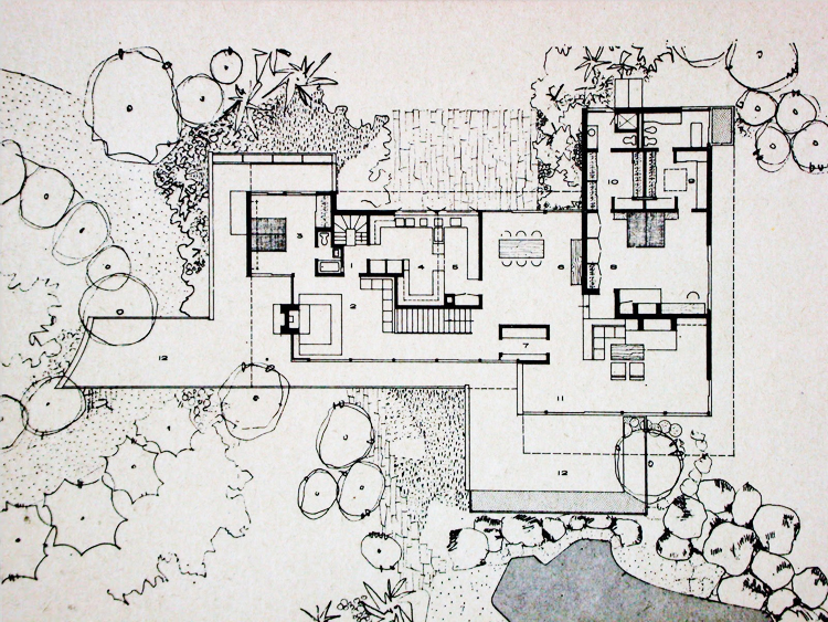
Like the EMCs, MCMs have huge swaths of glass that do not include window covers (an outdated historical nuisance, the curtain) or exterior shutters. Of course, at night those formerly light filled panes are totally black and make interiors a bit gloomy. Since there are fewer walls, there may be a dearth of space for hanging artwork. And of late there is a lot more computer work done at home and a very private area, acoustically isolated preferably, is important.
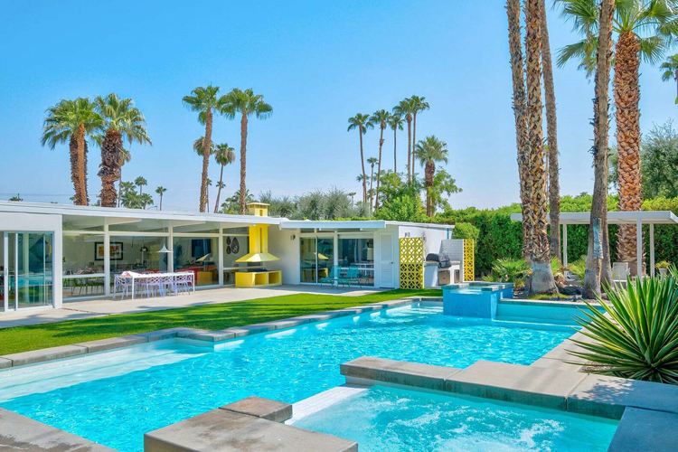
Photographs of the era seem spectacular with such a large amount of glass and reflections, the views… and reveal interesting specimens of imported ‘modern’ furnishings, but just about anything seemed to work in the smaller designs. One has to look closely to identify items added in succeeding remodelings and refurbishings.
Also keep in mind if building anew that the post and beam system of construction is not typically permitted and may even incur code issues and structural verification.
These designs are for very informal lifestyles. Open. Progressive. Should you like to buy or build one, consider the pros and cons.
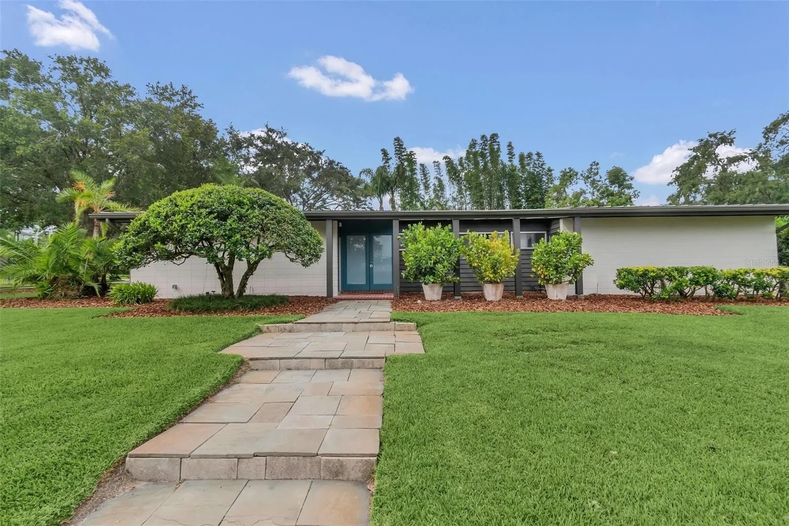
Should you have an interest in any of the Moderns, my suggestion is to replicate one of the latter designs from the 60s through the 90s, where the room configuration is more sensible — but the roofs still are quite flat.
Please see video of this essay here for many more photos, film clips, and the Kaufmann house schematic flyover:
Table of Contents
Follow NER on Twitter @NERIconoclast
- Like
- Digg
- Del
- Tumblr
- VKontakte
- Buffer
- Love This
- Odnoklassniki
- Meneame
- Blogger
- Amazon
- Yahoo Mail
- Gmail
- AOL
- Newsvine
- HackerNews
- Evernote
- MySpace
- Mail.ru
- Viadeo
- Line
- Comments
- Yummly
- SMS
- Viber
- Telegram
- Subscribe
- Skype
- Facebook Messenger
- Kakao
- LiveJournal
- Yammer
- Edgar
- Fintel
- Mix
- Instapaper
- Copy Link


