by Esmerelda Weatherwax (August 2009)
This is the first in what I hope will be several articles on English pub signs and peripheral bits of interesting, but not necessarily useful, information.
Over 25 years ago when I lived in Dagenham I used to visit a pub called The Angel in nearby Rainham which is the next village east along the north bank of the River Thames. There is also a Rainham on the Kent side of the river which may have been founded by the same bunch of Saxons but the modern villages are not connected.
Rainham was never a port on the scale of Barking where the abbey was but there was a trading in livestock and vegetables and a ferry over the Thames (which remained into living memory, although that memory did belong to a very old man) which was of some importance in the Middle Ages as one of the crossing points for pilgrims travelling south from the Marian shrine of Walsingham in Norfolk to that of St Thomas a’ Becket in Canterbury. Once on the Kent bank of the Thames they could pick up either the road travelled by Chaucer’s pilgrims to Canterbury or one due east to Rochester.
The parish church still contains a mediaeval wall drawing of a small ship, a cobb. The pub sign for the Angel was a painting of this ship afloat, overlooked by a beautiful Angel with proper wings and hair in an attitude of prayer and protection. One week we got off the bus and it wasn’t hanging. In its place was a badly executed sexy cherub, leering through a pastel haze.
“What did you do with the old angel and ship?” we asked, hoping naively that it was out the back and wondering if there was room for it in our garden.
“Had it painted over” said the Governor. “It was old fashioned and dull”.
The pub went into a gradual decline over several changes of management, closed, reopened, has reopened again as The New Angel but just has a rusting bracket with no sign the last time I was over that way.
I had no reason at the time to think that this was anything to predict a loss on a national scale.
We know that pubs are shutting at the rate of 52 a week so far this year and we have discussed the assorted reasons here several times. The smoking ban, exorbitant rent and rates to the landlord passed on as high prices to the customer, cheap supermarket beer, a changing demographic, onerous bureaucracy are a few even before we hit the recession. I am just concentrating on one of the outward visual aspects of the traditional pub, the sign.
It started with this article in the Telegraph in September last year.
Painted pub signs are dying out due to the rise of generic high street wine bars, conservationists have warned.
A failure to protect the signs will see the “catastrophic” loss of a much-loved feature of British cultural life and of the skills used for their production, they say.
Members of the Society for the Protection of Ancient Buildings have blamed the decline on the diminishing number of traditional pubs and the proliferation of chain bars including JD Wetherspoon and All Bar One, which use standardised signs.
Writing in the Society’s magazine, Tim Minogue said: “Like the pub, the inn sign is classless and central to British culture.
“And like the pub, it is acutely vulnerable. Inn signs vary wildly in artistic merit, have no official status or protection, are constantly exposed to the elements and are at risk of theft and vandalism.”
The Inn Signs Society, which now has fewer than 400 members, is attempting to win a Heritage Lottery Fund grant in order to build an internet archive of signs before the tradition disappears altogether.
Critics of the high street chains also accuse them of killing off pub names with historic significance to their local area.
Many regionally-named pubs have been taken over and given new names such as the The Slug and Lettuce and The Rat and Parrot.
“These corporate identities obliterate the historical significance of pubs and detach people from their roots.
Shortly after I went on holiday to Wiltshire and Somerset and spotted several intriguing pub signs. I decided to photograph these where I could, although my husband is not always amenable to my shouting “STOP! I see a pub sign” in the middle of a journey. Other times he has been happy for us to stop and he has taken quite a few photographs himself on his travels. Other photos have been contributed by the Luggage, my parents in law, our neighbours and friends including Gloria the Goth. Quite a few that we have taken have been of closed pubs; I am always more anxious to photograph them for fear the pub will never reopen and the sign will not be incorporated in the next use.
The importance of Pub Signs was raised again when they were voted one of the traditional icons of England as reported, again by The Telegraph, in December last year. This time the American born writer Bill Bryson said
“Traditional pub signs must not be allowed to die out”. He continued: “They are as characteristic of rural England as church spires and ancient hedgerows. The diversity of English life has been reflected in these intriguing and deceptively informative artefacts for centuries.”
I think it is a little unfair to include the Wetherspoon chain of freehouses in the criticism of the decline of pub signs. Since I have been taking the trouble to look more closely at signs and photograph them it seems to me that Wetherspoons pubs, while always in town centres, and always spacious (no quirky nooks that are an inefficient use of selling space) and frequently in converted shops or buildings of little architectural heritage they are often named imaginatively with due regard for local history and often have an individual sign. The only corporate naming is the fascination with the oo either moon or spoon in some names. Several Wetherspoons pubs are named The Moon Under Water, which, of course, is the name given by George Orwell to his perfect but hypothetical pub in his famous essay. Steve of Pub Philosopher pointed out to me the sign of the Lord Moon of the Mall which is a caricature of Tim Martin founder of the chain.
It is not always the case that because a pub has a fine sign it is also either a building of historical or architectural interest, or that it is going to be clean and comfortable inside, or that it is guaranteed to have well kept beer, preferable real. Plenty of lovely pubs have no sign or a boring one, although even if the sign is merely the name of the pub there is no reason why attractive lettering in appealing colours cannot be chosen.
However it is usually the case, and for the reasons that are obvious, that a pub with well kept beer is clean and comfortable throughout.
Only once have I found myself saying “I don’t care how many years this place has been in the CAMRA (CAMpaign for Real Ale) guide; the toilets are a disgrace and I am not drinking or eating a single morsel here!”
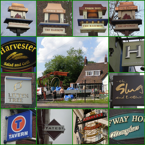
Some of the standard signs for the chains are quite attractive in themselves; their fault is that they never vary. Even if the old name is kept once you have seen one of the Ember Inn signs you have seen them all.
Below is a sample of the boring variety – the middle picture is of a serendipity moment when I spotted a pub just about to be given the bland makeunder treatment.
 This to the left could be called the sublime to the ridiculous.
The famous Dirty Dicks in Bishopsgate London next to which is a corporately identical Pitcher and Piano. Richard Nathaniel Bentley, aka Dirty Dick was the male inspiration for Miss Haversham. His fiancée died and he was so heartbroken he never washed again, or so it is said. The last time I was in the pub the tradition was for the customers to decorate the walls with paper ephemera. Pinned everywhere were bus tickets and cinema tickets and receipts for odd items. There was also a dead cat, which is not unique – I know a pub in Hastings with a dead mummified cat and a rat. I don’t know what is there now in this age of computerisation.
Next is a sample of the Wetherspoon signs I have come across, just to show that all hope is not yet lost.

You could spend ages trying to classify signs and not find a conclusive method. Some painted signs hang off the building, others hang on a pole, others are painted directly onto the wall.
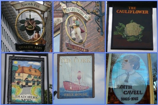
The Telegraph articles speak of the painted board. There are also the wrought metal signs like the Adam and Eve in Petty France and models such as the Greencoat Boy in Westminster. Some paintings are of exquisite quality like the new sign for the Cauliflower in Ilford. The owner is very proud of it and was pleased to hear that I approved. Others like the Thatchers Arms in Warley are in a more ‘primitive’ style but still appealing. Some signs are definitely a print pasted onto the boards. The Cork in Felixstowe has at least two boards on every wall of the pub, two pictures a board is at least 16 pictures and I am certain they are prints as none differ and I can see bits peeling. It is also the only pub sign that I have spotted so far that is signed by the artist – Pete Long. I have also included a stained glass sign at the front of a pub opposite Norwich Cathedral on the grounds that it is very attractive, and that Edith Cavell is a worthy and interesting subject.
Otherwise I have been generally placing signs in categories according to their subject matter – eg work, rest and play, interesting people (that one could run and run) animals, ships and boats and so on.
The commonest pub name in England (sorry to omit Wales and Scotland – they are different countries for this purpose and I don’t go there often) is The Red Lion. There are also plenty of White Lions, Golden Lions, lone Lions, a few Black and Blue Lions, British Lions, and one or two Brown, Silver, Yellow and Green Lions. There is also the sign which started this madness, The Dandy Lion in Bradford on Avon.
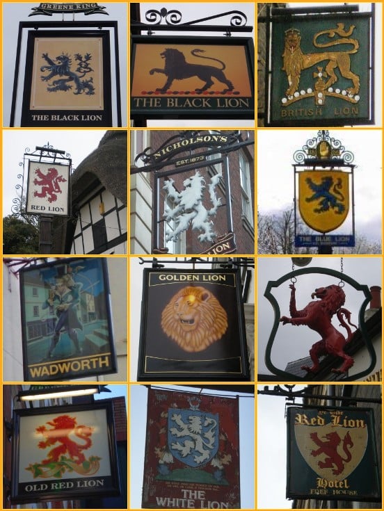
The Lion is a very common symbol in heraldry; the Red Lion is specifically associated with John of Gaunt and later King James I of England and VI of Scotland. Others which have become common inn signs are the White Hart which was the personal badge of Richard II, the Bear and Ragged Staff was that of the Earls of Warwick. The Rose and Crown is also royal and English and became popular at about the time the Scottish King James was encouraging the use of his Red Lion. The Rose and Crown hinted at loyalty to the Crown – of England. The Crown speaks for itself, the Crown and Thistle is rarer, the Feathers is the symbol of The Prince of Wales.

Fear not for my health – while I have been in many of these pubs I have not been in them all, nor have I drunk alcohol excessively while taking these photos. What I have done is walk briskly around some of the more interesting parts of London and provincial towns. 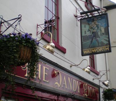
Exercise.
Fresh air.
The occasional beer.
What could be nicer?
More to come.
If you are interested I have placed links to the photos in larger versions on the photo-share site Flickr with more details. Just click on the mosaic photos and, fingers cross you should be transfered.
To comment on this article, please click here.
Esmerelda Weatherwax is a regular contributor to the Iconoclast our community blog. To view her entries please click here.
To help New English Review continue to publish articles such as this one, please click here.
If you enjoyed this piece and would like to read more by Esmerelda Weatherwax, please click here.


- Like
- Digg
- Tumblr
- VKontakte
- Buffer
- Love This
- Odnoklassniki
- Meneame
- Blogger
- Amazon
- Yahoo Mail
- Gmail
- AOL
- Newsvine
- HackerNews
- Evernote
- MySpace
- Mail.ru
- Viadeo
- Line
- Comments
- SMS
- Viber
- Telegram
- Subscribe
- Facebook Messenger
- Kakao
- LiveJournal
- Yammer
- Edgar
- Fintel
- Mix
- Instapaper
- Copy Link