by John Henry (May 2021)

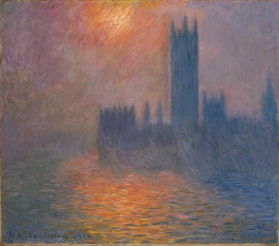
Houses of Parliament, Sunset, Claude Monet, 1900-1
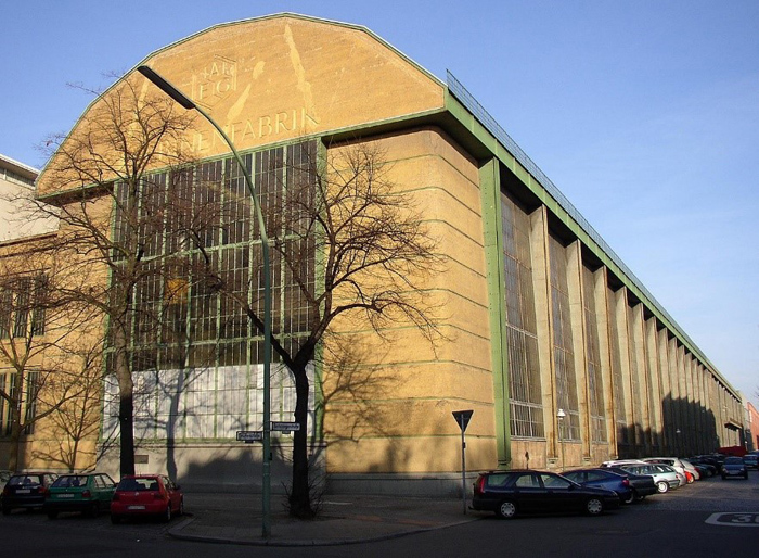
Well, it has already been happening. For several decades now. In fact, it has been woke since classical or period style was wholly rejected by the likes of the European imports of architects Mies van der Rohe, Le Corbusier, and academician Walter Gropius. (below right: Peter Behrens, AEG Turbinenfabrik 1909)
 In the last 20 to 30 years especially, no one has had to spend any political capital urging architects to ‘break out of the box’ or ‘push the limits of design,’ etc. No—no one is asking architects to reimagine things. Architects have plenty of imagination—and ego. They do not require prodding. Architects of this age are desperate to gain attention by promoting artifices featuring twisted steel and ‘plastic’ forms, punched holes in annoying buildings that lean, erecting branded skyscrapers to competitive heights, designing structures inside-out without skins, and attaching alien pieces of glass and steel onto historic stock.
Most ‘starchitects’ have been creating the most unpredictable designs possible to shock public sensibility more than anything else.
They want to make us feel uneasy by angling and curving spaces beyond any reasonable expectation. They feel they have accomplished much by inducing vertigo and other psychological maladies.
Above all: they want everything to look unconventional and are breathlessly against traditional forms.
 These orgasmic fantasies (Bilbao Guggenheim, right) occur mostly in privately funded work. Public work in the United States tends to be boring. A very aggressive city or county government has to push for moneys that could create 5 more ‘normal’ buildings with the same budget necessary to push through a single affront that exhibits progressively acceptable artistic and social thinking—buildings that the established elite arts intelligentsia would fawn over and become the base for incessant reviews and accolades.
Reimagining policing, immigration, climate control, or political conflict obviously yields benefits. But to whom?
In the cases mentioned—usually an aggrieved or marginalized group, or one who demands more attention in order to sway public opinion (completely if possible) —‘reimagining’ is the route employed. This is a recent concept. Of course, ‘reimagine’ is a euphemism for all types of sought-after change that typically takes too long to effect observing legal procedures or developing cultural norms—whom a minority approve, and others are expected to follow suit.
An applicable definition of woke is: “A politically correct narrative that has Marxist principles at its roots and doesn’t tolerate open discourse.”
 There is no doubt that Modern architecture has roots in socialism, perhaps a bit of Marxism. Philip Johnson has been branded a Nazi and Corbu was definitely a socialist, Wright too. But there is an Ayn Rand aspect also that gets little play: rational egoism. There is a fierce individualism that cannot be questioned, a right for self-achievement and the pursuit of happiness based on an objective belief system. We (the users) must tolerate all artistic ‘protest’ and expression. Architects do not get bloody pushing their concoctions, but they certainly provoke a reaction.
This is a direct parallel to today’s woke political culture. One side is right, one side is obviously wrong. There is a right approach to architecture and one that is incorrect. Certain styles are woke, others are not. By shaming, denigrating, provoking, shouting down, and ignoring any rational argument (because there is none), one side can win over the other with ignominious tactics. This strategy is a matter of course in the academic institutions of architecture, art, philosophy, literature, and law. One practices what one is taught in academia without question. One pushes a particular narrative over another without thorough analysis. Certain positions are thought scurrilous, outdated, backward, and not deemed proper for consideration or available as an alternative. There is tacit acceptance of even the most absurd notions.
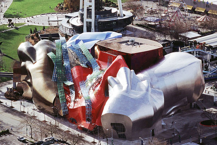
 About twenty-five years ago I was leafing through my last issue of Progressive Architecture. The part where I stopped reading was when the contractor for Seattle’s Experience Music Project (right) was asked how he was able to build something that had so many twisted structural elements. Where to start? It was truly a nightmare to look at under construction. He said he had to set up a point in space with his transit and work out from there. I thought at the time that this was an entirely absurd way to go about designing and constructing buildings of any kind. I immediately ended my subscription and began to be wary of this ‘new’ architecture. (PA ceased publication in 1996.)
I became skeptical with the ‘deconstruction’ approach to architecture. Although based on some kind of esoteric academic nonsense, it basically sanctioned the breakup and manipulation of a building’s surface. In effect it meant that anything goes from now on. Of course, it was based on constructivist architecture in 20th century Soviet Russia! Isn’t that prescient?
This Post-Modern (the genetic architectural cartoon predecessor) style now abandoned any similarity to historic design—its goal was to skew any notion of architecture in the traditional sense. It railed against established norms. And it demanded zero interference. The academicians were all behind the International Style, the beginning of the end of classicism in the ‘20s, as soon as the building developers clamored for architects well-trained in this new approach who could eliminate brick details, gargoyles, moldings and any hand wrought iron or sculpture, in favor of shiny sheer glass, steel or concrete structures that were the result of our ‘machine age.’ Pure rational thinking. For pure profits. Eliminate the artistic façade and build it faster and cheaper.
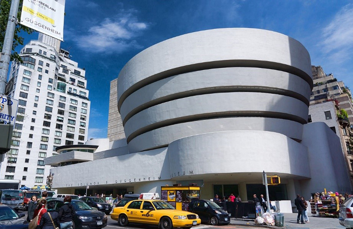
 Privately funded concerns later realized that having an ‘iconic’ building by a starchitect would no doubt put their organizations on the social/cultural map. It was a financial risk worth taking. The Guggenheims therefore hired Frank Lloyd Wright for their New York museum (right) and later Frank Gehry for one in Bilbao. Instead of allowing patrons to visit separate rooms with exhibits normally displayed, Wright had to ‘reimagine’ the idea of art gallery by forcing viewers to stand obliquely on a linear spiral ramp with rectangular art pieces hanging on an exterior wall tilted from the ceiling and floor. The center atrium is a waste of usable space on a tight building block. The design has never been repeated. At Bilbao, the Project for Public Spaces claims that “the building limits the role of architecture to a mere icon, viewing the domineering structure as an interruption on the landscape and as degrading to civic and cultural life.”
Curving skins of metal, as in L.A.s Disney Concert Hall was another early tour de force application that was only possible using nautical software. I watched in horror as the outer metal skins were assembled over the most jumbled mess of wires, ducts, insulation and steel I had ever seen.
The ultimate question is: Does the product being generated advance in any way the public good, improve urban design for the masses, and aesthetic sensibility in general? Do these adventures in self-referential angst promote wellbeing or do we have to suffer every time we pass them or visit or work in them? Do we look forward to frequenting these anomalous museums, studying in warped academic environments, living in the ultra-contemporary condos and idiosyncratic office buildings or are we just relieved and supremely happy when we go back to our private abodes?
Who gains when art is run amok?
__________________________________
John Henry is based in Orlando, Florida. He holds a Bachelor of Environmental Design and Master of Architecture from Texas A&M University. He spent his early childhood through high school in Greece and Turkey, traveling in Europe—impressed by the ruins of Greek and Roman cities and temples, old irregular Medieval streets, and classical urban palaces and country villas. His Modernist formal education was a basis for functional, technically proficient, yet beautiful buildings. His website is Commercial Web Residential Web.
Follow NER on Twitter @NERIconoclast
- Like
- Digg
- Tumblr
- VKontakte
- Buffer
- Love This
- Odnoklassniki
- Meneame
- Blogger
- Amazon
- Yahoo Mail
- Gmail
- AOL
- Newsvine
- HackerNews
- Evernote
- MySpace
- Mail.ru
- Viadeo
- Line
- Comments
- SMS
- Viber
- Telegram
- Subscribe
- Facebook Messenger
- Kakao
- LiveJournal
- Yammer
- Edgar
- Fintel
- Mix
- Instapaper
- Copy Link


